DoorDash Restaurant Sign-up Landing Page (SPEC)
Client:
DoorDash is an online platform that connects restaurants with customers who want to order food online, for delivery or pickup.
Challenge:
To sign up small, independently owned restaurants who rely on Facebook for marketing and are wary of new technology. Incoming traffic was from a Facebook ad.
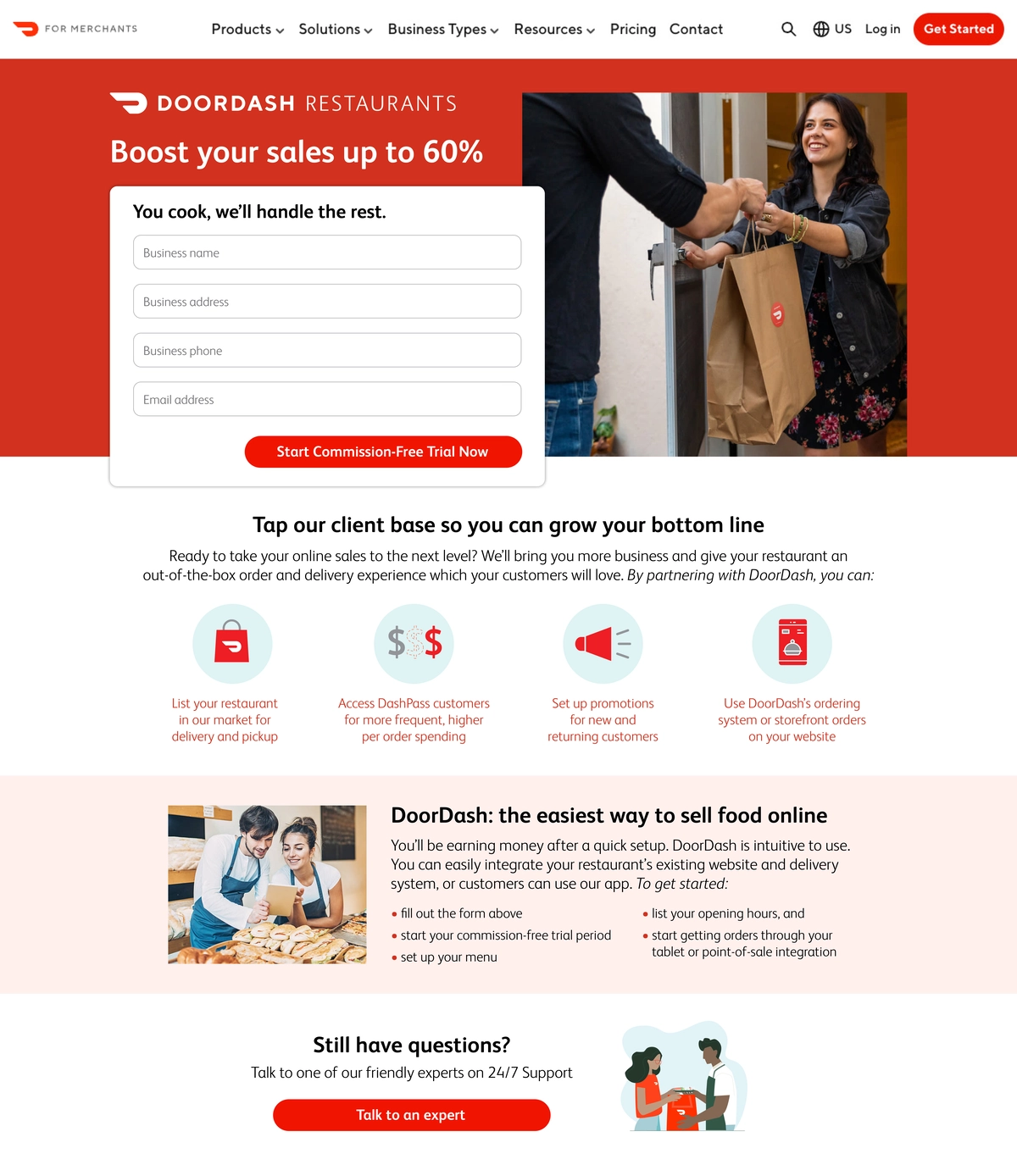
Solution:
I wrote a heading and subheading in the top section that delivered clear benefits to restaurant owners, and then showed an invitingly simple sign-up form. The CTA (call to action) also lowers resistance by reducing risk (a commission-free trial period). Subheadings in the following two sections express the secondary benefits (increasing sales and easy set-up/use). Copy was short, with short sentences, short paragraphs, and bullet points. By keeping copy easy to read and with zero jargon, I reassure technology-averse potential partners that DoorDash is user friendly. Steps are listed in bullet points. The first step refers to filling out the form. The last promises that they will start getting orders right away. Finally, I include a link to friendly experts on 24/7 support for restaurant owners who still have questions. The page is short enough that the main benefits and CTA are visible at a glance.
Designer: John Milligan